Beyond.
Role
UX/UI Design, User Research, IA
Timeline
Feb - June 2023
UX/UI Tools
Figma · Sketch · Miro · Adobe Photoshop · UsabilityHub · User Testing · Optimal Workshop · Zoom · Slack · Hand-Drawn Sketching
OVERVIEWCancer patients need to securely access their personalised medical plan to feel empowered to take control of their journey towards better health.
The Problem
Beyond is a responsive web portal that aims to empower cancer patients by providing them with a new avenue to learn about their illnesses and bodies and support their recovery through personalized medical plans.
The Goal
Design Thinking Approach
At Beyond, I utilised a method of generating design concepts and resolving market issues by empathising with user needs and comprehending their pain points.
UNDERSTANDCompetitive Analysis
A competitive analysis helped me gain industry insight and create a solid UX strategy. Using SWOT analysis, I evaluated competitors' approaches and identified strengths and weaknesses.
Strengths
Personalized, user-focused services.
Internationally inclusive
Weaknesses
Poor overall UX strategies
Poor UI design
Overwhelming amount of text
Opportunities
Implementing UX strategies
Implementing UI strategies
Tailored services
Track mental and physical improvements for comparison.
Threats
Personal advice apps using AI.
Broader personalised services
Cancer services partnering with health centres
BRD
Once I understood the competition I faced, I compiled a business requirement to have all teams aligned on the same page towards building the product.
Target Audience
Anyone older than 18
Family members/health caretaker of a cancer patient
Gender Inclusive
Device and Internet usage: basic to advanced
Functional Requirements
Personal guidance by a cancer coach
Personal nutrition advisor
Personal direction through applying for social rights and benefits
Store, log and share medical documents
Tele-health
Display of recommended and personalised information
User Stories
I could then create user stories, bringing the business requirements to life by shedding light on important aspects of the project.
“As a cancer patient who often carries all of the medical documentation to every doctor meeting, which can be heavy and sometimes messy, I want to be able to store and sort my records on my private online account.”
“As a cancer patient, I want to access relevant content that is relevant and recommended for me so that I can educate myself about my progress, know what to expect and be aware of the possibilities I may have.”
“As a cancer patient who is undergoing treatments and might feel unwell, I want to have the option to attend appointments from home via video call.”
OBSERVEUser Research
Once I became familiar with the landmark I was working in, I set a goal to understand my users' needs through generative research.
Research Goals
Identifying the need of cancer patients for personalised information
Identifying the struggles and pain points of cancer patients throughout their cancer journey
Gather insights from potential users about which features could be beneficial for them
Collecting evidence from users that indicates the need for an online, personalised cancer service
5 Participants
11 Questions
50-70 Minutes
-
Age: 46-55
Location: Berlin
Occupation: Dog daycare
Status: Married + 2
Diagnosis: Stage 3 Invasive breast cancer at 46
Type of Treatment: 16 rounds of chemotherapy, one surgery (lumpectomy), 13 rounds of daily radiation, five years of tamoxifen and ultrasound scans every three months for two years
-
Age: 35-44
Location: Berlin
Occupation: Full-time mom, part-time event manager
Status: Married + 2
Diagnosis: Breast cancer at 37
Type of Treatment: Six months of chemotherapy, two surgeries, one month of daily radiation, five years of tamoxifen, and ultrasound scans every three months for two years.
-
Age: 35-44
Location: Berlin
Occupation: Artist
Status: Single
Diagnosis: Aggressive Breast Cancer and lymphoma at 37
Type of Treatment: 1.5 years of chemotherapy, six breast and arm operations + two years of treatments
-
Age: 35-44
Location: Berlin
Occupation: Customer service
Status: In a relationship
Diagnosis: Endometrial cancer at 38
Type of Treatment: Removal of the uterus under surgery
-
Age: 25-34
Location: Berlin
Occupation: Administrative manager
Status: In a relationship
Diagnosis: Stage 4 Hodgkin Lymphoma at 24
Type of Treatment: Five months of chemotherapy
Affinity Mapping
I dived into all the data I gathered and mapped it to identify relationships between the separate components.
FACTS
BEHAVIOURS
FRUSTRATIONS
NEEDS / GOALS
QUOTES
Insights
I kept sorting and re-sorting the data to uncover hidden patterns. I devised solutions for problems cancer patients didn't always know they needed and gathered those into three groups: Education, guidance and emotional support.
Education
Cancer patients should understand their illness and have access to information throughout their cancer journey, including possible symptoms and next steps.
Guidance
Cancer patients must trust and feel comfortable with their doctors to follow their orders. That will reduce distractions and help them focus on treatment and recovery. They may need guidance in various areas.
Support
Learn how to cope with cancer, express emotions, and reduce loneliness.
POVUser Personas
With the above information in mind, I then composed persona empathy maps, which helped me sort the data by identifying common thoughts and emotions.
User Journey Maps
Having two primary personas, I could start building their relationship using my product through journey maps to identify high-level problems the user might face.
ideateUser Flows
The next step was to create user flows for my personas to understand how they would interact with my product. That allowed me to view the process from their perspective and ensure their requirements were met.
Information Architecture & Card Sorting
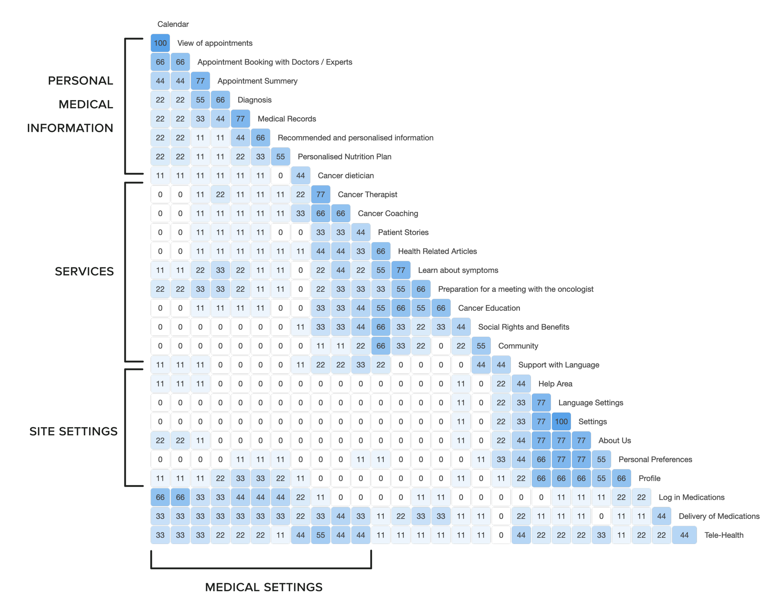
I began constructing the hierarchy structure of my responsive website. To determine the categories for the sitemap, I used open card sorting through Optimal Workshop. The results and insights are presented in the following similarity matrix:
Conclusions
The findings exhibit only occasional consistency.
More explicit labels could have been employed to prevent confusion.
Nonetheless, I discerned four primary information categories within my web app.
Improvements
Organising, structuring, and labelling the content in a way that facilitates intuitive navigation.
Conduct multiple rounds with different participant groups to validate findings.
Finish with closed card sorting for a comprehensive understanding of users' behaviour.
Sitemap
With this information at hand, I revisited my initial sitemap structure and implemented the new insights in a new design:
prototypeFrom Low to High Fidelity
I could finally express my ideas on paper and bring them to life. I began by exploring the basic structure of the web app.
Store and share medical records
testUsability Testing
I was ready to assess the effectiveness of my wireframes by involving real users in usability tests. Eager to gather insights from potential users, I conducted usability tests with five participants; two moderated in person, while three moderated remotely. Allow me to introduce two of the most notable participants from the sessions.
4 Scenario Tasks
5 Participants
15-20 Minutes
Maayan M.
Age range: 35-44
Profession: Client manager
Location: Berlin, Germany
Usability Test: Moderated remote
Observation Notes:
Understands the purpose of the web app at first glance.
Nevertheless, finds the layout needs to include its purpose.
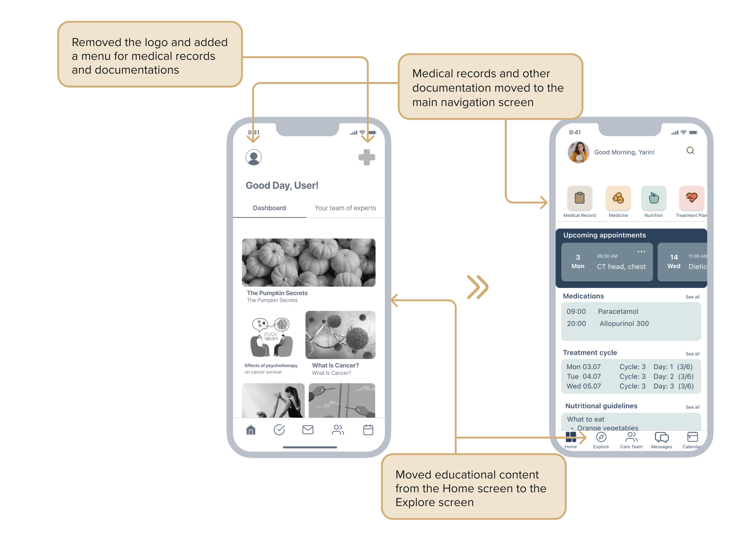
The navigation could have been more straightforward.
The profile menu bar should be for technical use and not contain cancer-related content.
Everything related to cancer should be visible from the main navigation.
Neta A.
Age range: 35-44
Profession: Office manager
Location: Berlin, Germany
Usability Test: Moderated remote
Observation Notes:
Understand the purpose of the web app at first glance.
Understand the need for scientific information but disagree with its appearance on the home page.
Finds the navigation needs to be more explicit.
Struggles to understand why some features are under "user settings". She explored the web app further and found some sense in it.
Gave valuable insights into the content and the layout.
Affinity Map
To obtain the most valuable insights from the usability tests, I separated the data I extracted from the audio and video recordings and documented it on paper. I categorised the data, analysed the relationship between each piece of information, and identified new patterns that were previously unrecognised. I then divided the information into four categories: OBSERVATIONS, POSITIVE QUOTES, NEGATIVE QUOTES, and ERRORS. In the end, I had 25 observations I could follow.
OBSERVATIONS
POSITIVE QUOTES
NEGATIVE QUOTES
ERRORS
Usability Test Report
The analysis results revealed some essential aspects that require the application's design improvement. The research has identified specific areas, including navigation, information presentation, and functionality, that are crucial for enhancing the user experience. The app can provide users with a more seamless and enjoyable experience by addressing these areas.
“I believe having the option to book an appointment separate from the calendar means having two similar features.”
“I find the essential things hidden on the app while associating “profile” with settings and less critical features.”
“I want to open the app and see my appointments, new updates regarding my illness, graphs of progress, etc.”
- Participant 5“The label ‘social benefits’ does not call for action and gives the impression of navigating there to get information.”
- Participant 1Usability Test Insights
After conducting usability tests, I have learned the importance of prioritising user feedback and placing users at the centre of the design process. It served as a valuable reminder that, as designers, we can sometimes become overly focused on our ideas and false assumptions. However, listening to the feedback provided by users helped me recognise the significance of understanding their needs and preferences. While it may only be possible to satisfy some users, gaining insights into their requirements is essential for creating effective design solutions that resonate with them. This experience reinforced the importance of empathy and user-centred design principles in creating a meaningful and impactful product.
Design Language
Final Version
Retrospective
Reflecting on my experience building a case study based on real users' needs, I've gained meaningful insights into human-centred design principles. I learned that it's essential to maintain constant interaction with the target audience and seek feedback throughout the design process. Initially, I was concerned about conducting User Interviews related to cancer, as it's a susceptible and private topic. However, I realised there is an acute need for a channel of communication and empathy through my users. The journey has been eye-opening, and I feel proud that my users trusted me enough to open up to me.
The UI aspect presented challenges related to technicality, as I set high expectations for myself. Finding a sense of self-contentment was difficult, but I remained focused by maintaining open communication with my users throughout the process. While it wasn't possible to please all users equally, engaging with them ensured that their needs remained at the forefront of my design concept.
Future Improvements
Conducting another round of usability testing to gather additional user insights and implement design decisions based on the new findings. That will ensure the app remains user-centred and effectively addresses users' evolving needs.
Continuing to design more flows within the app to enhance its functionality and user experience. That involves identifying improvement areas and refining the app's design to offer a seamless and intuitive user journey.
Designing the app's desktop version to expand its accessibility and usability across different devices and platforms. That enables users to conveniently access the app's features and resources from their desktop computers.
Developing support features tailored explicitly for cancer patients facing end-of-life situations. That could include resources, guidance, and support networks to help patients and their families navigate this challenging phase with compassion and dignity.
Prioritising efficient time planning to ensure that project tasks and milestones are managed effectively within the available resources and timeframe. That involves setting clear objectives, breaking down tasks into manageable steps, and allocating resources efficiently to optimise project productivity and progress.


